Final Draft (Front cover , contents page and double page spread)
Front cover

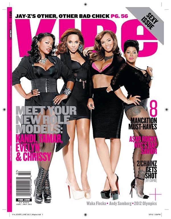
Masthead
My masthead is an acronym for "Rhythm and blues"and "hip hop"this can be found in my slogan just beneath my masthead establishing the genre of the magazine . I created my masthead by using "ariel black" font this font allowed all my letters to be alingned aswell as stand out . The last two letters "HH" I changed the colour from black to pink to higlight a special edition female issue ,as pink can be said to be a common colour assoiciated with females. The effect bevel emboss and the use of a drop shadow has given my masthead the edge making it the most eye catching convetion on the page .
Coverlines
My front page consists of only one cover line "Annalisie breakthrough artist ... meet the star herself".The choice to change the colour and give the main coverline an outerglow was to make it clear to the reader of the main feature article found in the magazine , Also highlighting the connection of the article to the photograph.
Titles
Instead of coverlines I featured artists names to fill the rest of my front cover .This idea was inspired from an XXL magazine(Chris brown issue) were only the artists names apart from the main coverline were the writing amongst the page. This technique provides the reader with more insight to the content in the magazine . Choosing the colour pink to tie in with the female edition theme but using grey to break away from the pink as it became very animated which can be seen in my first draft. I continued to used "ariel black" for the font of the names with the blending option of a drop show giving the names a platform to stand out.
Photograph & background
There were many complications with finding a background to suit my photograph as I found it was becoming lost amongs block coloured background .To create my background I blurred the original background from the photo taken and found that out of all the backgrounds I tried to create it looked the best .
Other conventions
I included a date as well as the the type of issue in the top right ear of the front cover .The date is in all black as its not of greatest importance but still needed to be included .I used the same effect used for the main coverlinefor "exlusive female edition" just changed the font to italics to give it a feminin touch.Finally the barcode placed in the bottom right hand corner .
Contents page

Masthead ,titles and headings
My masthead is repeated onto the contents page placed in the top left hand ear again followed by the magazines slogan this time in all black . The second title is presenting the contents page to the reader with the words reading "this week..." in white writing to stand out and the use of one pink letter tying in with the female theme this can be found in the page numbers and key words in attemp to draw in the reader .
Much like my front cover instead of shocking headlines I used the artists name in bold black and any shock factors highlited in pink.
Design features
I provided black rectangles as backgrounds for my contents list, my title and competition feature to divide different sectors separating them from the articles at the same time giving them the platform to stand out as as much as the features are important so are the other info provided. On either side of my masthead pinstipes a design feature aswell as a space filler complimenting the colour scheme.
Photographs
The biggest photograph is an indication of a popular artist or a big article , the smaller photos again more favoured artists with an eyecatching story.Also an image of the front cover can be found on the contents page advertising and persuading readers to suscribe .
Fonts and content
- Bernard MT condensed is the font used for my page list a font that even when small stands out
- Anne boleyn the font used for my article headlines gives a suttle tone against all the other bold quite edgy fonts .
Double page spread

Titles/Headlines
My double page spread consists of two Headlines the first introducing the article "RBHH MEETS ANNALISIE" Still including my masthead theme with the first two letter being black this is in order to identify the magazine if a reader were to see the double page spread stand alone . The second heading an introduction to "Annalisea's" timeline of her journey as a star . Although both different fonts, to seperate each other from article to time line. I used fonts that were clear and consise for the reader to identify them as headings.Context
To start of my article in the beginning and after the pull quote I used larger font for the first letter of the first word. This was a way of letting the reader know as to were the article began. Throughout the spread you can find information about the upcoming star and her history .In order to draw away from huge blocks of writing I featured a questionnaire with the questions in pink this allowed for my text to be Broken up to keep the readers focus. My pull quote another convention to break up the text and draw them in by giving them a taster if the content this can be found in 90% of magazines of any style or genre .
Photos
For my double page spread I used the same image to cover both pages but the use of the "flip horizontal" and fading on the right not only took out the feeling of repetition but my article could be read at the same time instead of throughout my research I commonly found article on block coloured backgrounds . The other three photos featured on the time line were another for of interest a brief visual if readers didn't have to much time to read the whole article .The photos also supported with a date and what they each represent .